Link for fly-through: http://live.datascapevr.com/viewer/?wid=c26b2318-ec14-457a-9ae5-dc64bc0fc6e1
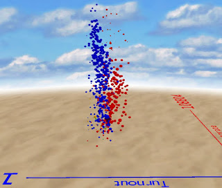
Just testing out a minor update for Datascape when I decided to plot the 2015 General Election results data on a scatter plot, not geographically. I chose:
- X: electorate
- Y: Margin/majority
- Z: Turnout
- Size: Size of UKIP vote
- Colour: Winning party
A quick fly around of the data revealed a number of interesting points:
It is at the small majority end where we tend to see the smaller parties - few of them have massive majorities in their seats.
And the most striking - looking at the turnout axis the Conservatives dominate in the high turnout seats and Labour in the low turnout seats. Cause or effect?
Update: 7 June 17
Here's another visualisation we really like - just showing the vote for each of the main parties across all the constituencies. The fly-through link is:
http://live.datascapevr.com/viewer/?wid=7959ce9e-5cce-4b7d-8dd4-44adeddea7e7
Here's another visualisation we really like - just showing the vote for each of the main parties across all the constituencies. The fly-through link is:
http://live.datascapevr.com/viewer/?wid=7959ce9e-5cce-4b7d-8dd4-44adeddea7e7


No comments:
Post a Comment