In this post we'll show you the basic workflow in Datascape so that you can get a good idea of how it works.
1. Choose a Workspace
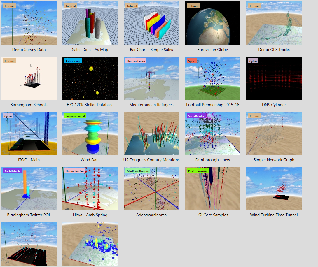
The workspace defines the backdrop and axes. As well as standard XYZ axes you can also have a world map (or in fact a panel with any texture on it), or a dynamic Open Street Map pan which you can pan and zoom to anywhere in the world. There is also a 3D globe, and again you can change the texture on that (Mars anyone?).
2. Import Data

You can import directly from Excel or CSV files. YOu can also use the SQL readers to hook directly into a SQL database. Hadoop, JSON etc coming soon. You can preview your data, optionally set field types, and Datascape warns you of any errors or gaps in the data as you import. All we ask is that there is one line of data for each point you want to plot on screen.
3. Choose a Mapping Template

Datascape comes with a set of mapping templates for the most common chart styles - including geospatial (height=altitude, or other value), geotime (height = time), spherical and cylindrical (to save you the maths!). Or you can choose Manual Mapping and roll-your-own.
4. Customise the Mapping

This panel is the absolute heart of Datascape. Here you specify how each attribute of the plotted point is defined, in terms of either fixed values (eg "red"), or fields form the data. You can use standard SQL functions, and combine fields in quite complicated ways to define each attribute - but often you'll just go click-click-click to assign individual fields to individual attributes. You can also use Translation Tables to convert numbers or text to colours and shapes.
5. Visualise, Explore and Iterate

Then click on Plot! You can then fly around the space, viewing the data from any angle, inside and out. The best bet is to get something basic plotted first (even in 2D, set Y=0), and then add Y, colour, shape etc to enrich the visualisation and get it to start telling you what is going on in the data. You can change the axes scales if you need to spread the data out more, and use a search box or dynamic "scrubbing" filter to pull out subsets of the data. You can hover over a point to read its hover text, click on it to see all the data fields for that record, and if you've defined one in the mapping even click through to a URL in your web browser to examine a related web page (eg an entry in a star catalogue).
And that's the basic process. Datascape comes with several demo workspaces that you can play around with to see how the mappings work before you import the first of your own data.
Happy plotting!
